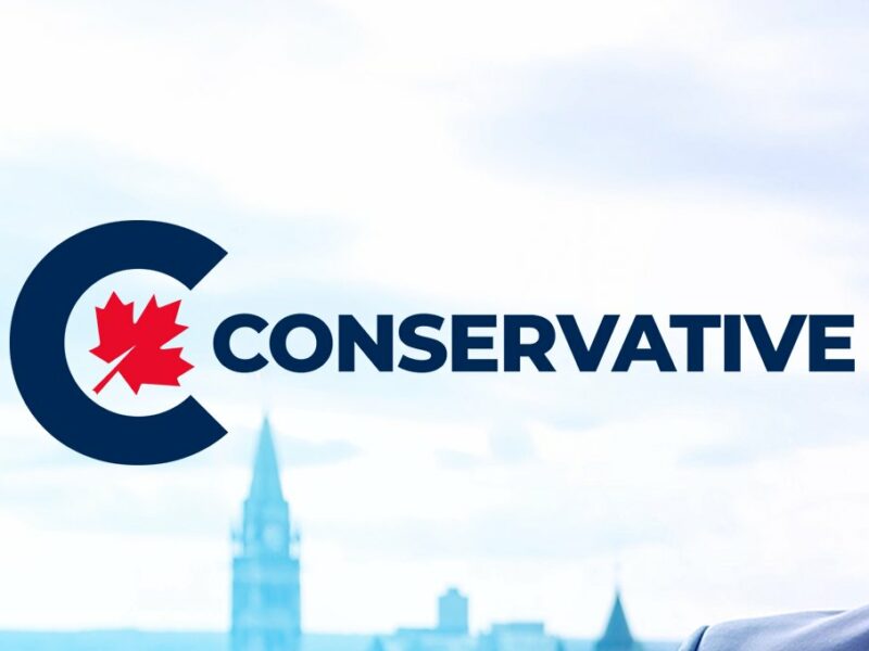


OTTAWA – Canada’s official opposition party has unveiled a new logo and a new name to go with it, and are proudly inviting Canadians to say hello to the new Cconservatives.
“We’re putting Canada first, because the first C stands for Canada. But it also stands for so many other good things that start with C,” said Cconservative leader Erin O’Toole. “It stands for consistency, and courage, and conservative. Little c conservative, as opposed to big C Cconservative.”
While some political experts believe the party’s rebranding is merely a way to save face after not realizing their expensive new logo contains two C’s close together in a similar enough font for the whole thing to appear as one word, the Cconservatives are adamant that this name change was undertaken because of deeply held beliefs about Canada and conservatism, and has nothing to do with covering for poor graphic design choices.
“Our new logo symbolizes our commitment to Canada,” O’Toole explained. “And I want to make something clear that a lot of people are getting wrong when they look at the new logo: the maple leaf is not askew and does not therefore symbolize that we have a distorted, partisan view of Canada. It’s intentionally pointing gently to the right. That’s totally different. I mean, who would trust a political party that can’t even get their logo correct? But we did, so rest assured, you can trust the Cconservatives.”
Leader O’Toole isn’t the only Cconservative to have nothing but praise for the new logo. “It looks right to me,” said Ppierre Ppoilievre.
The Liberals are also considering updating their own logo by adding a splash of green which will represent both their commitment to environmentalism and their acquiescence to rapacious corporate greed.


